
PRODUCT DESIGN • UX RESEARCH • UX DESIGN • PROTOTYPING
SUBWAZE
Making daily commuting in NYC feel safe and stress free! This 0 to 1 product design was built by getting into the depths of NYC/NJ public transit issues. We conducted a thorough generative research and evaluative research to make this product usable.
My Role
Conducted both generative research and design.
Participated in designing the survey questionnaire, preparing interview scripts, data analysis, persona creation, journey mapping, affinity mapping and moderated usability tests.
Was also largely involved in the product ideation stage wherein I crafted mind maps and used the SCAMPER and MuSCoW methods to realize the features for the 0 to 1 product design process.
Created UI Components for communicating information to the users about their commute, helped design the wireframes and helped in building the branding and style guide.
3 Product Designers + Me
Team
Tools
Figma, FigJam, Miro, Whimsical, Zoom, G-Suite
Overview
We decided to focus on solving the issue of unpredictable commutes in NYC. Through personal experience and primary research, we noted several potential opportunities to improve the NYC transit experience.
10 weeks
Duration
Problem
How might we provide a way for commuters to feel safe and stress-free when they commute on the MTA?
Solution
Smooth and Easy Reporting
Report Incidents in-between subway stops
Easily categorized incident-types for ease of reporting
See report on map and have the issue validated by other commuters.
Get updated during your commute!
Get step-by-step, intuitive guidance during your commute and know how much travel is left through the progress bar.
Know if any incidents have occurred while you are traveling.
Get a summary of your travel.
Get subway-related updates with the power of a community!
Community reports around subway station incidents to help you plan your travel ahead of time.
Easy way to get situation overview with images.
Sort incidents as per your route, location and time of occurrence.
Our Approach
We followed the product design process and maintained an iterative approach toward our design.

Generative Research
We used the following methods to understand our users, their situation and learn if and how competing products solve the problem. We conducted surveys, interviews and a competitor analysis to get a gist of the problem and figure out how to approach the problem.

Screener Surveys
Our screener survey was used to determine people’s travel habits, the most common issues they faced, the frequency of such incidents and their willingness to use a service for reporting incidents.
We received 38 responses and out of them, 30 participants qualified for an in-depth user interview.

Interviews with Users
We wanted to learn our participant’s experiences on the subway. It was especially important to understand how seriously and how deeply they felt about the incidents that have occurred to them We also took a chance to learn what kind of services they are looking for to improve their experience and if they were willing to be the ones reporting an incident.

To find common themes and pain points, we considered it best to synthesize the interview data using affinity methods. The data was extremely lengthy and a huge task, grouping similar themes.
Below are some of the snippets from our affinity map.
Data Synthesis


Based on the insights we received from our interviews, we combined our detailed findings and looked at the major issues encountered by commuters at a higher level.
Insights
Meet Emma
An energetic New Yorker, always out and about with an undying obsession with music and parties. This is Emma. She has always wanted to make her transit experiences as smooth as possible.

Follow Emma to a Concert
In an attempt to empathize with our users and ideate more opportunities, we created a journey map highlighting Emma’s recent concert trip.

Competitor Analysis
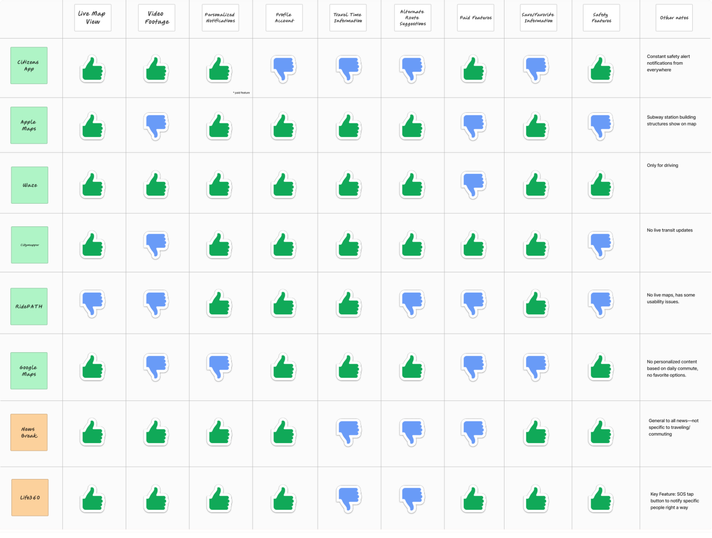
We conducted a competitor analysis of various direct and indirect competitors. We did this to understand how different services had features that were solving any problem related to commute. We also looked into the availability of features that were required by our users.
Product Ideation
We used mind maps, lightning demos, SCAMPER Method, Dot Voting and MuSCoW method to finalize key features of the product.


Key Features

User Flow
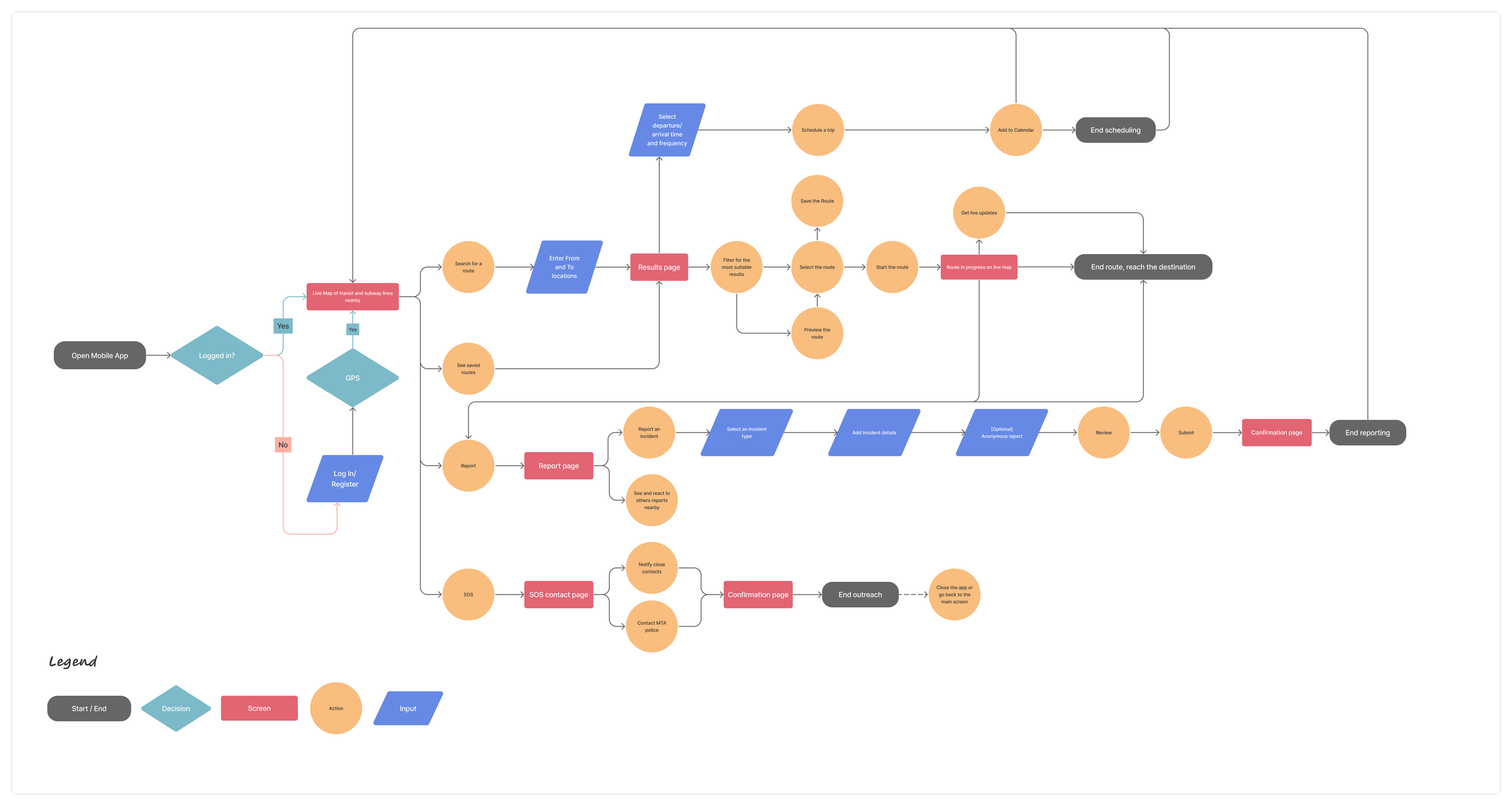
Iterative Design
It was important for us to define the flow of our tasks. We wanted seamless experience of conveying important transit-related information to our users. We started with crazy-eights to quickly brainstorm how we wanted the user to consume the product.
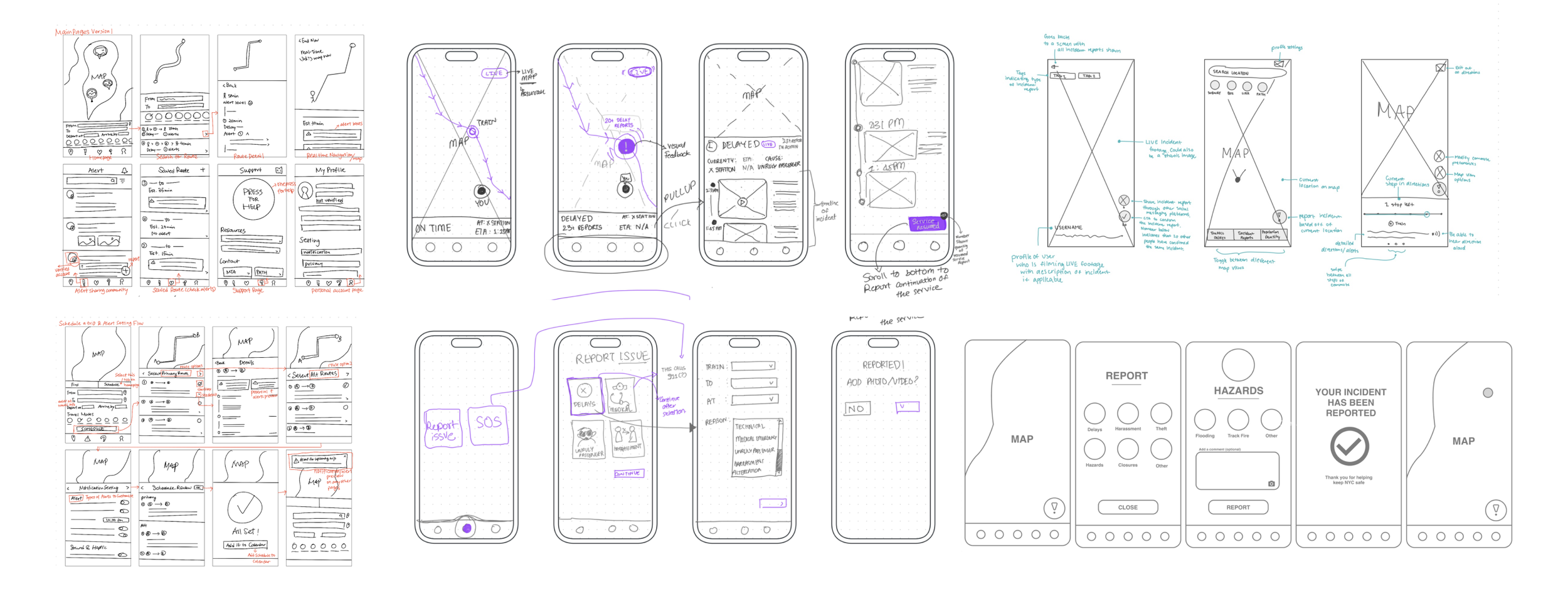
Mid-Fidelity Stage
We made several iterations to u prototypes, I specifically created UI components designed to inform the user about their commute. I also collaborated on the ‘homepage’ design and negotiated to keep it simple and minimal for increased efficiency when in use.

Usability Testing
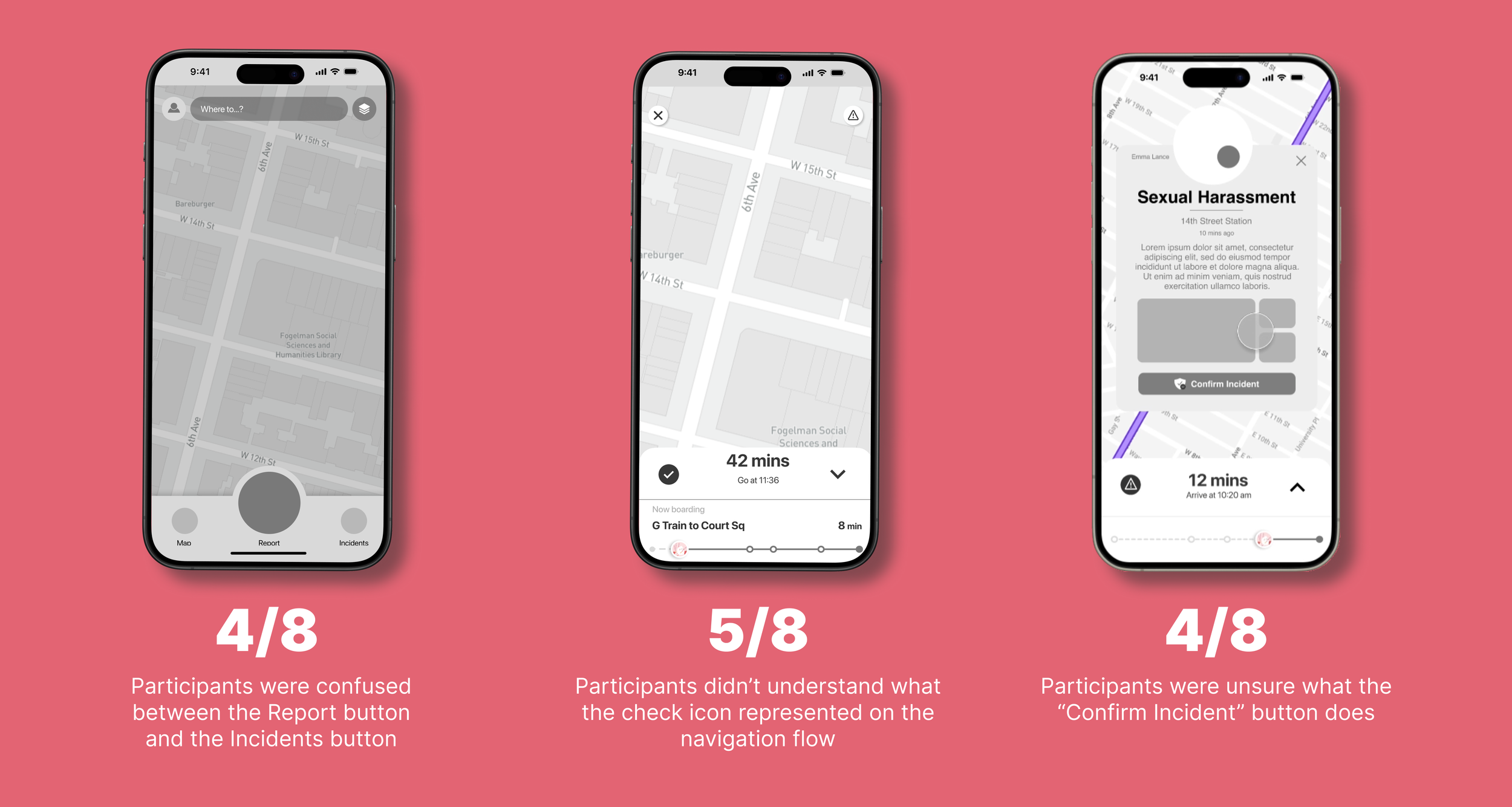
Were our wireframes understandable enough? Were we good to go? To understand this we conducted usability tests with 8 participants. We decided to test the understandability and functionality of the product by giving our participants 3 key tasks.
Task 1: Start a route and get incident alerts during the trip.
Task 2: Report an incident.
Task 3: Get regular alerts for daily commute trip.
With every task, we gave our users a unique scenario. All of our tests were moderated with 50% being in-person and other 50% being remote.

Result
What went well…

What went wrong…
Based on the opportunities we discovered from our usability tests, we developed our high-fidelity prototypes. We also incorporated our NYC-based visual branding and developed components for ease of work.
We made sure we implemented the following into our design:
Design Iterations
Clear Visual Language
A style guide (smaller design system) to maintain the playful image of the product.
Simplicity of Design
We made sure our design remained simple and easy to use.
Understandable Language
Since some users were unable to understand certain labels on our buttons, we simplified the language.
Conveying time-sensitive and instructional information to the consumer was the most challenging part of this product. This particular flow underwent 5 to 6 different iterations.
Key Flow 1. During The Commute

Wireflow for the task
Our entire user flow is presented through wireflows to help understand how consumers will interact with our product and consume the necessary information.

Key Flow 2. Reporting Incidents
Another challenge for us was to make reporting incidents simple, quick and intuitive. It was also necessary to provide social validation to the reported incidents to increase trust.

Style Guide
We realized that when commuting, especially when reporting any incident, the stress levels could get high. Noting this, we crafted a soft color palette with playful icons and unique branding for an NYC experience. The rats, subway and Empire State Building remained an integral part of Subwaze.

Reflections
I loved the unique challenges this product posed. This was also my first time designing a mobile application. We focused a lot on research and this was a 0-1 product which made the project all the more exciting. It was fun to explain this product’s stand-out features during the critique. We received great feedback from the visiting panel as well as our peers in this class. If I had more time, I would have loved to conduct an A/B test to understand audience preference for a second UI design that I did. I would also love to expand on more features as well as experiment with the iconography.
This product also left me with one question - would it be possible to make reporting a native feature rather than an exclusive app?
I look forward to experimenting with designing a similar feature for Google Maps and Apple Maps whilst exploring their design systems to see how it would impact people’s willingness to use this kind of service more.