
UX RESEARCH • PRODUCT DESIGN • CLIENT PROJECT
National Gallery of Art
I led the design of a new game for the National Gallery of Art; from concept to delivery. This game was designed to increase DAUs on NGA’s website after its revamp in 2025.
ROLE
Lead Designer for ArtSwipe
I conceptualized and delivered the design for ArtSwipe, conducted thorough primary and secondary user research, produced wireframes, created interactive prototypes and iterated based on feedback.
TEAM
2 User Researchers
2 UX Designers
2 Product Managers
Data Analysts
DURATION
10 weeks
TOOLS
Figma
FigJam
Zoom
TL;DR (Summarizing for a quick read)
WHAT DID NGA NEED?
A game! But this game had to be educational with the potential to attract users through word of mouth.
Have you ever noticed how Wordle is played by every other person and talked about? YES, EXACTLY!
btw… did you solve today’s Wordle?
IMPACT
ArtSwipe gained significant preference from our testers (75% loved it!) in terms of gameplay and the potential to help players learn about artists and their art styles. We also optimized the project turnaround time.
Did you play ArtSwipe today?

Nope, let’s play together!
METHODOLOGY
To create a game product from 0 to 1, we decided to use the following strategy:

What is ArtSwipe?
ArtSwipe is a game that helps new website visitors learn about the artists and art showcased at the National Gallery of Art.
It uses widespread interaction patterns such as swiping to help the player categorize the artwork with its artist.
ArtSwipe comes with 2 playing options!
Single player for when you want to play by yourself!
Multiplayer when you have that competition ON!
By simply copying and sharing the link, invited player can join the room!
The host chooses the contents of the challenge!
ArtSwipe let’s you choose what artists and media you want to swipe from
The host has full control of the game specifics
There are only 2 levels; ‘Normal’ and ‘Hard’.
Swipe Left and Right to Win!!!
Simple swiping motions that can help categorize art to artists
Interaction gestures mimic swiping from dating apps that many visitors would be used to!
Points are reflected immediately and feedback is spontaneous!
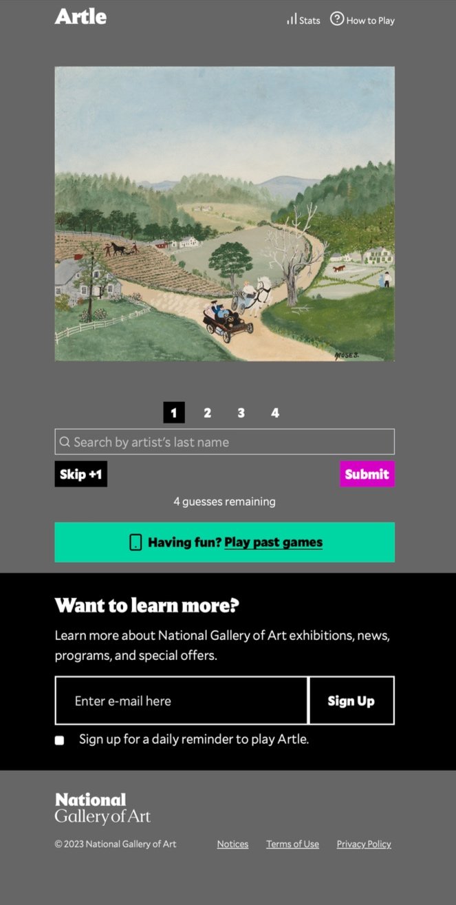
Artle told us…
What not to do!
Artle was the subject of our technical analysis and 6 moderated usability tests. This was because we wanted to determine the mechanics behind NGA’s first game, the overall gameplay and any loopholes we would want to avoid.
We found out that Artle lacked better signifiers and did not make players feel motivated to play it. The overall interface lacked mechanisms that could create a successful game.
We also found players using reverse image lookup to solve Artle. Overall there was a lot of difficulty with figuring out how to play the game and get the correct answer.


Our user interviews made us realize that people play content similar to Artle differently than they play content similar to big name games (Eg. Fallout, Valiant, Pokemon Go!, you name it!)
User Interviews provided more clarity
Play on Subways or when they wake up/lunch break
Prefer competition with themselves and close friends over strangers
Want to learn something about artists through the game instead of feeling ignorant
WAIT…. how are games designed?
Creating a short form game is a mental exercise in itself. We wanted to make sure we knew the recipe of engaging games and games that can help someone learn something, so we proposed literature reviews.
So, umm.. lit reviews anyone?
Through literature reviews, my team focused on 3 questions to ask ourselves when we designed the game.

What is the Goal?
What is the Obstacle?
What are the tools?
I undertook the task of researching and comparing effective games with competitors. Understand their mechanics and their product strategies to showcase their collections.

Learning from competitors
We found that the games catered to these 4 specific types of players:
4 player types!

Guessers
Solvers
Groupers
Fun lovers
Now comes the fun part…
ArtSwipe is Born
How is it played?
Imagine 2 artists
Now Sort
My team and I brainstormed around 8 different ideas. All the games had to do with NGA’s pre-existing collection.
I was wondering, how do I cater to players, bring an easy-to-play game that can be used to learn about art as well as create fun interactions?
I went down memory lane and realised that simple interactions and gamifying logical actions can create a fun learning experience.

ArtSwipe included several aspects that are used in game mechanics.
Not only does is it require the player to use logic, the simple interaction of swiping and sometimes using guesswork makes it a great game with depth and complexity.


Mid-Fidelity design
There was not much time after NGA finalized taking my concept further.
We had to conduct usability tests as well as create high-fidelity designs within a week or two after the tests. In order to test the main gameplay, I created mid-fi prototypes with interactions to get the most accurate feedback.

Testing led to improvement
We received feedback from our participants for ArtSwipe. I suggested a within subjects test for both the games to indicate user preference as well as highlight any usability and playability issues. We conducted a total of 9 tests.


Users could not figure out instructions
Premature feedback easily gave away the answers making it easy to cheat
The deck felt static, players thought there were not many cards left
Key Changes
I created and added instruction animations to clearly demonstrate how to play, as well as changed the writing
Created an accessible and delayed way of showcasing right or wrong answers stopping any cheating attempts.
Delivery to NGA
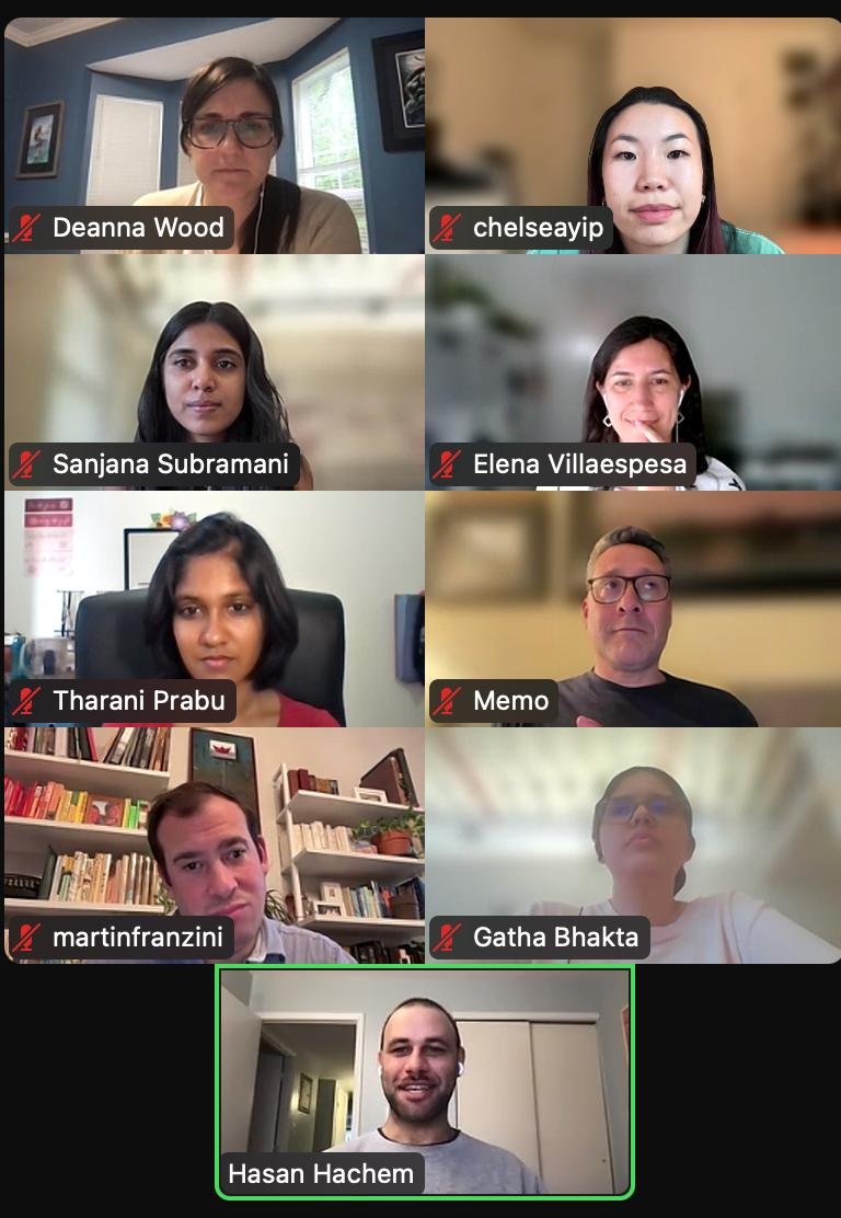
When we presented our games to the NGA team, ArtSwipe received positive feedback, which made me very confident in my product-thinking skills.
We thought a lot about ArtSwipe and this was a novel approach, where it is used a comparison tool, something we never thought of...
Martin Franzini
Chief of Digital Product and Experience, NGA
With ArtSwipe, I really appreciate the nuances you were thinking of.. with the indicators, we are big with accessibility and the fact that you thought of naming levels like ‘Normal’... Great Job
Deanna Wood
UX Designer, NGA
This is really really cool, I love (Art)Swipe! Love the effects and the way you indicate what’s right and wrong. Can’t believe you did this in the amount of time you had.
Memo Saenz
Product Manager, NGA