
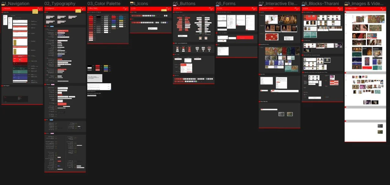
UX DESIGN • DESIGN SYSTEM • UI KIT • DOCUMENTATION
Mosaic Design System
This is how we brought consistency, charm and ease of development to the website of Rubin Museum of Art. Accessible, scalable components drive this Design System.
Check Documentation and UI Kit
Details
Duration: 4 weeks
Team: 2 designers + me
Tools: Figma, ZeroHeight
About The Rubin Museum of Art
The Rubin Museum of Art or the Rubin Museum, is a museum that originated from the collection of Donald and Shelly Rubin. The museum is focused on collection, display and preservation of art and culture of Himalayas, Indian subcontinent, Central Asia and a collection primarily and permanently focused on Tibetan art.
And I…
Created components such as buttons, interactive elements like maps, sliders, cards, alert messages and set the typography for paragraphs, special quotes and banner headings. Also, decided on the colors and visual design to make sure it conveyed the museum’s values and principles.
TL;DR
WHY A DESIGN SYSTEM?
The Rubin Museum of Art has a rich collection of webpages to showcase its projects and exhibitions, however, we noticed a number of inconsistencies throughout the webpages. The colors were not accessible as well.
IMPACT
This design system is designed specifically for the Rubin Museum of Art and is unique to its mission and values. This system also helps in quick building of webpages for the museum’s website. This system saves revenue and time, below are the estimated savings and ROI with Mosaic.
1.4K
Hours Saved
640K USD
Cost Savings
74%
Efficacy with time
Process at a glance
My team included, 2 designers, Radhika and Tharani.
The project started with Radhika recognizing inconsistencies among the website and auditing it for any accessibility violations. The museum’s website, although well designed at first glance, had multiple inconsistencies and many non-accessible design tokens.

Inconsistencies and excessive components
When you look at the Rubin Museum’s website, things seem fine at first. With the eyes of designer, you start noticing the issues it has. Inconsistencies, a different component for the same function and violation of accessibility standards at several instances.
Imagine, being a designer and creating a new button every time you update a project page. For the engineer, tons of CSS with every component. Decision-making is yet another way of dragging the time unless you get paid for overtime :)
We wanted to stop that.


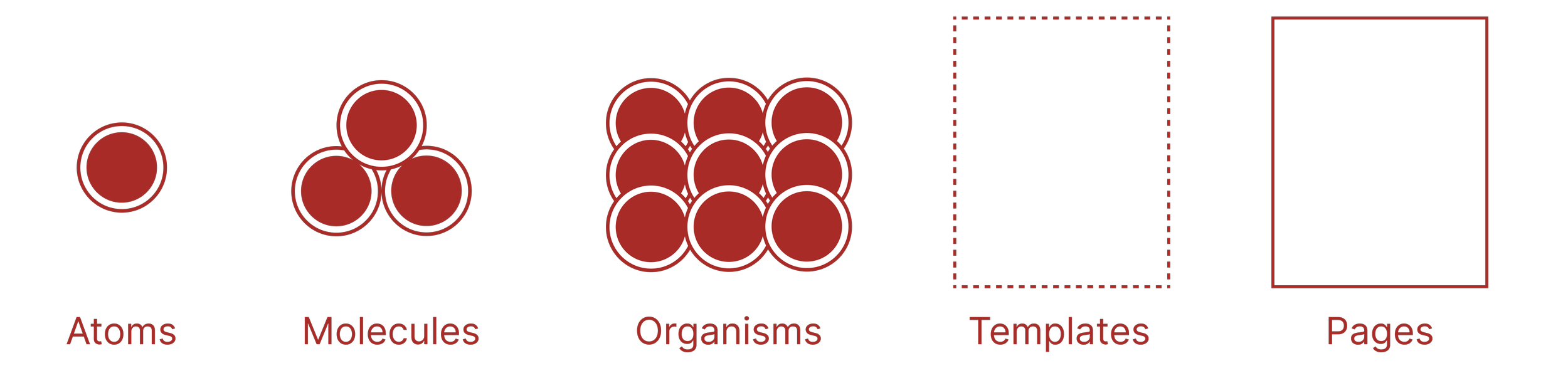
We used the Atomic Design methodology by Brad Frost.
Building a system
There are 5 distinct stages to creating a design system using this method. They help in creating a well-defined, comprehensive design system. The stages are:
Atoms
Molecules
Organisms
Templates
Pages
Foundations, the atoms
Defining brand values
The first step was defining the foundational values. We defined the principles, color schemes typefaces and icons. Everything at the atomic level.
We looked into Rubin Museum’s principles and values to help us define the same for our design system.
Creativity
Creating elements that are more aligned with the museum’s content
Accessibility
Making content accessible to all users irrespective of ability, ensuring accessibility to knowledge and collections.
Engagement
Engaging people from all backgrounds and communities with the collection.
Learning
Facilitating learning through designing an exploratory path through the website.
Foundations
Typography and colors
We wanted to add some character and charm to the web pages designed using Mosaic, consistency was the highest priority, so we chose 3 fonts to convey our brand values and display, Rubin Museum’s beauty.
We also defined 4 main colors to revamp the brand.

Components, the molecules
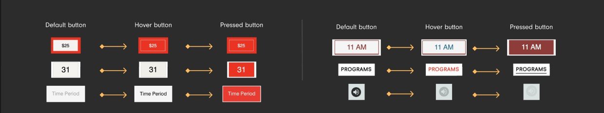
Buttons
Extremely easy to change buttons!
We made sure that each button was accessible, all their states were clearly defined and icons were appropriately sized. These components are extremely easy to use with the different states assigned as per hierarchy, theme and user actions.
Boolean values have also been added to remove or add icons.
“Your system is so comprehensive!”
-Tester


Components, the molecules
Navigation
The original navigation for the Rubin Museum contained 2 styles, a vertical and horizontal navigation bar. To make it easier for the visitors of the website, we consolidated both of them into a single navigation bar.
The existing footer is not accessible, hence we designed a new one as a component for ease of use.


Clear and Accessible Navigation
Components, the organism
Hero Covers
Hero Covers, beautiful, customizable and quick.
A large portion of Rubin Museum’s website features their collection with a banner, which we called ‘Hero Covers’. These Hero Covers capture the visitors' attention and get them interested in the project being featured.


Components, the organisms
Blocks
Some elements are not buttons but are crucial to the website’s system. Alert messages, Quotes, Pagination and Accordions were among these.
It was necessary to define these blocks since the Rubin Museum used these components, although inconsistent by design. We added consistency and played with a color palette to come down to these components.


Usability Testing
Is our system easy to use?
It is necessary to consider that ‘WE’ as creators would not be the primary users of this system. It would be used mostly by designers on the team and developers for reference.
Since our system is mainly intended for designers, we tested the system with 3 of them. There were issues regarding some components missing as well as their categorization.
We found that Mosaic is Scalable, Comprehensive and Easy-to-use.


Documentation
ZeroHeight it is!
We decided to add socialization to our design system. To have users collaborate with us on this by reporting bugs or any suggestions for the system. We also wanted to make finding resources easier and add more instructions to our design tokens. Hence, we decided to take the documentation to ZeroHeight.
We also made sure we informed the users of the usage of each component we crafted. This was to help the users design with intent.


This was a lot of learning! I feel like a Figma Ninja and someone who now knows what a UI Kit is and what a Design System is.
Takeaway
Trial and Error
We had to constantly create dummy webpages using our components to see if our sizes were perfect and if our components fit aesthetically.
Striving for Perfection
Sometimes, components can not feel like they belong to the intended system or its values. During this time, it is necessary to keep going until you reach a final design that blends in seamlessly.
I am not the User
A Design System is created for the people and not for the creators. Our job is to make the work easier.
Pitching
It is necessary to create a pitch of your product to sell it. We needed to prove how it will make the jobs of the team at Rubin Museum easier and why they should adapt it.