
UX RESEARCH • MIXED METHODS • WEB ANALYTICS • EYE-TRACKING
Affirmation Studio
Affirmation Studio offers affirmation audio and text to help users manifest their goals. Their main objective was to acquire more users to purchase their premium version of the app as well as have them adapt to newer features such as Binaural Beats. We helped them focus on the issues that could solve this problem and help them achieve their target.
Details
Duration: 10 weeks
Team: 3 researchers + me, 2 Product Owners
Tools: Mixpanel, Amplitude, Tobii Pro, Google Sheets, Google Docs, Figma
About Affirmation Studio
Affirmation Studio is a mobile app that provides users with a powerful tool for manifestation and personal growth using AI and Binaural Beats.
It also offers a library of affirmations in both audio and text formats, designed to help users cultivate a positive mindset and achieve their goals. The app uses AI to generate personalized affirmations based on user prompts, tailoring the experience to individual needs. Additionally, it enhances the audio affirmations with binaural beats, a unique feature that promotes relaxation and focus, allowing users to fully immerse themselves in the affirmative messages.
What was the problem?
Affirmation Studio was unable to acquire users who were interested in using their premium features, AI and Binaural Beats. Their main goal was to boost their acquisition and increase revenue.
So, what did we do?
We first scoped the research with product owners and then focused on assessing the usability and effectiveness of the user flows that were crucial to conversion and engagement.


And I…
Moderated eye-tracking usability studies, assisted in understanding behavioral data from web analytics platforms, chose methods for analysing the data from studies and synthesized qual and quant data from the studies.
Also provided actionable insights to the clients for improving usability and acquisition as well as created presentations, mockups and reports to communicate findings to them.
TL;DR (Summarizing for a quick read)
WHAT DID AFFIRMATION STUDIO NEED?
After the kickoff meeting, we realised that Affirmation Studio wanted some understanding and clarity on their userbase, their habits and to see how they would convert to use premium features.
They also lacked a dashboard to track important metrics for conversion and did not have a dedicated conversion funnel.
IMPACT
Affirmation Studio will experience fewer drop-offs which will be due to an increase in the SUS score, engagement with premium features, and ultimately more conversions due to that, successfully moving toward product-led growth.

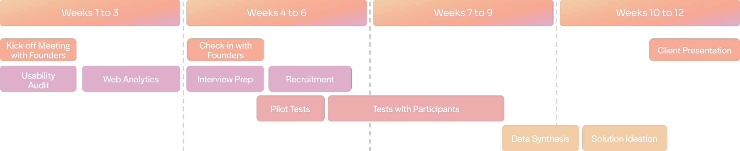
METHODOLOGY
To answer these questions, we decided to execute the following strategy:

Timeline
To make sure we made the best use of the time, we decided to follow a very strict schedule. We started with a UX Audit before meeting the clients so we could understand their needs.
How web analytics helped us decide on our tasks
We decided to look into behavioral data to gain an understanding of common problems encountered while using the app.
We tracked 90 days of data for three metrics on Mixpanel and Amplitude:
Onboarding Drop-offs
Engagement with the AI Affirmation Generator
Engagement with Binaural Beats

Now to see the WHY behind the data
We wanted to know why these trends were occurring in the first place. We wanted to solidify our findings with data gathered by observing users using the app themselves.
So, we proposed an eye-tracking study.
So, umm.. eye-tracking?
Eye-tracking would be beneficial for us to understand where the user expected a certain function to be on a screen and to see where they focused while using it.
Our eye-tracking tests were followed by an RTA.
The RTA helped us to gain an even deeper understanding of the eye-tracking studies. We would replay the videos and ask the users about their reasoning.
Using the eye-tracking data to understand users’ behavior and focus
We converted the data into heatmaps and gazeplots to support our findings.
These heatmaps and gaze plots provided the founders with a detailed overview of users’ activity once in the app. This was to help them improve their interface design and user experience.
Some important screens we analyzed using heatmaps were screens related to the AI feature and Binaural Beats.


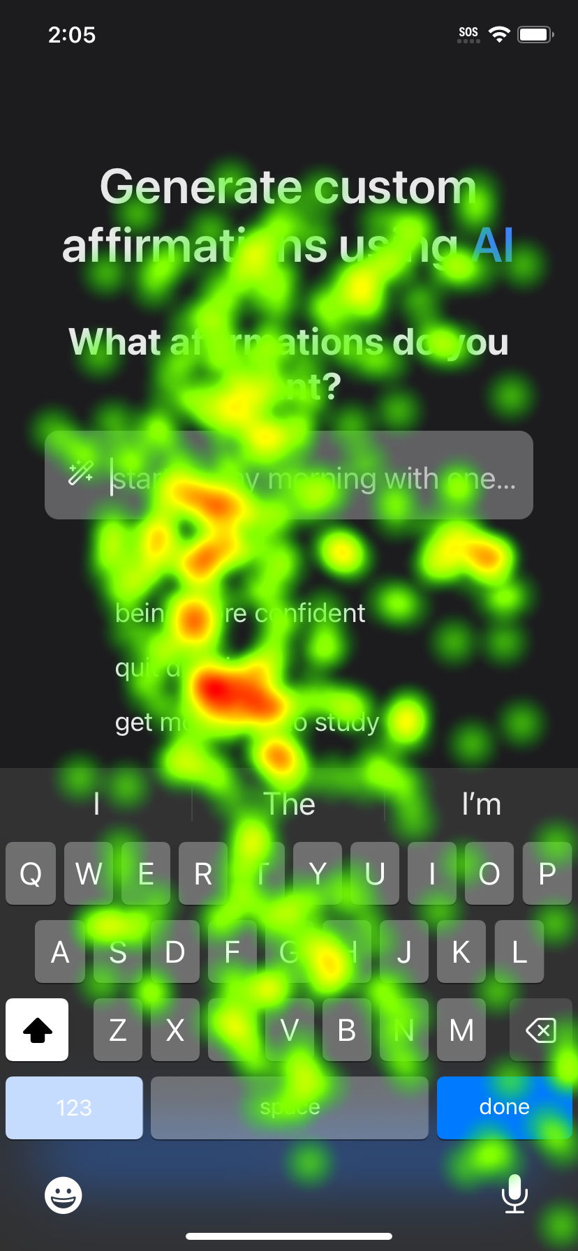


Limited discoverability of premium features
The users were not able to add binaural beats to their audio
The users could not figure that Eve was the AI used to create personalized affirmations
After synthesizing over 360 minutes of qualitative data and quantitative data tracked over 90 days, we found that the limited discoverability was caused by the app’s confusing interface and lack of explanation to the users.
6/8 users could not add binaural beats to their audio.
They mistook it for adjusting the volume. When asked to add Binaural Beats, they did not look at the icon used for adding them but rather shifted their focus on the modification tool next to it.
“I thought its an icon for gallery”
-Participant

8/8 users struggled to locate Eve, the AI feature.
They explored the voicebanks even if they were confused about them looking like social media profiles. They had to click through all of them just to get to Eve.
“Why do I have my instagram friends here? Why do these look like profiles”
-Participant
“These look like social media profiles”
-Participant


So, how do we go about solving these usability issues?
My team and I had a serious brainstorming session where I suggested to a solution for each of these problems. To make it easier for Nick and Kerry to visualize, we created some very high-quality mockups on Figma.
This helps users explore this feature without needing to get around every single feature within the app.
SOLUTION 1
Consolidate audio settings and Binaural Beats into one page
What is right now…


What it should be…


SOLUTION 2
Eve can be easily discoverable with a small UI update
The tag mentioning AI on Eve when clicked, can be made permanent even when Eve is not selected. This will make the feature more prominent and help users realize the value of the app upfront.

How did we deliver our results to the stakeholders?
We noticed a pattern among our interviews, and as researchers we knew exactly what they were.
However, our clients are not aware of UX Research, its methodologies, the reasoning or protocol.
To help them understand where they needed to look, we provided them with tangible, digestible and crisp data, synthesized into Rainbow Sheets and Stop-light charts. We also offered coded data with severity ratings so that they could address the listed issues in the future.
I asked my team to convert the data into Rainbow Sheets because they are effective at translating data into a quantitative narrative.
The data visualization through this method is very effective for communicating to non-researchers such as PMs and other cross-functional team members.
Rainbow sheets? What… Why?

Coding the data
We also coded the qualitative data into themes that further solidified our findings. Providing recommendations for each, we helped Nick and Kerry optimize their app’s UX for a satisfied user base.
The severity ratings are supposed to help them with the number of users who faced usability issues while using their app.

The final day - presenting a treasure of data!
With a midpoint check-in, almost 4 weeks ago with our clients, we had made significant progress with data collection and analysis.
The founders were extremely pleased to see our findings in the form of a presentation over Zoom.

What’s next for Affirmation Studio?
If our recommendations are implemented, one can expect the overall usability of the app to improve.
SUS scores are directly proportional to user experience. The better the experience, the better the chances for acquisition.

Key Takeaways
Considering Eye-Tracking
Eye-tracking is a great method which could help us understand where the user was looking. RTA gave us great information into the user behavior.
Another Method?
When we did RTA, we followed up with small interviews where I asked my participants to use the device and app freely and share their concerns, this gave me a much richer understanding of where the participants were coming from.
